Introduction to Price Charts
价格图表简介
A price chart displays the price of a particular market over a period of time. You can change between different time frames on any charting platform. Chart time frames range from 1 minute charts all the way up to monthly and yearly charts.
价格图表显示特定市场在一段时间内的价格。您可以在任何图表平台上的不同时间框架之间进行更改。图表时间范围从 1 分钟图一直到月线图和年线图。
There are three main types of charts: Line charts, Bar charts and Candlestick charts. For price action trading, the candlestick chart is most commonly accepted as the ‘best’ type of chart to use.
图表主要有三种类型:折线图、条形图和蜡烛图。对于价格行为交易,K线图最常被认为是“最佳”图表类型。
However, let’s go through a brief overview of each chart type just so you get familiar with them…
但是,让我们简要概述一下每种图表类型,以便您熟悉它们……
Line Charts 折线图
Line charts display the price of a market via a line that typically connects the close of one time period to the close of another. Here’s an example of a line chart:
折线图通过一条线显示市场价格,该线通常将一个时间段的收盘价与另一个时间段的收盘价连接起来。下面是一个折线图示例:
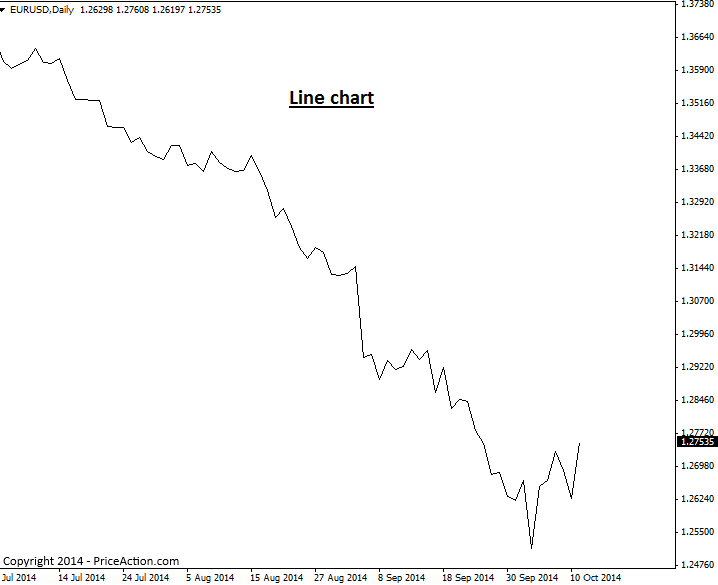
The main advantage of a line chart lies in providing you with a quick view of the overall market trend and support and resistance levels. They are not practical to make trade entry or exit decision from because they do not display individual price bars. However, as previously stated, if you want to get a quick view of market trend and key levels, a line chart may prove useful occasionally.
折线图的主要优势在于为您提供整体市场趋势以及支撑位和阻力位的快速视图。它们对于做出交易进入或退出决定不切实际,因为它们不显示单独的价格柱。但是,如前所述,如果您想快速了解市场趋势和关键水平,折线图可能偶尔会很有用。
Bar Charts 条形图
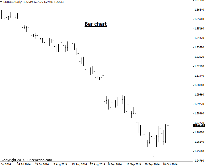
A bar price chart shows a ‘standard price bar’ for the time frame being observed. If you’re looking at a 1 hour chart, you will see a standard price bar for each 1 hour time period, a daily bar chart will show a standard bar for each day on the chart, etc.
条形价格图表显示所观察的时间范围内的“标准价格条”。如果您正在查看 1 小时图,您将看到每 1 小时时间段的标准价格条,日线图将在图表上显示每天的标准条,依此类推。
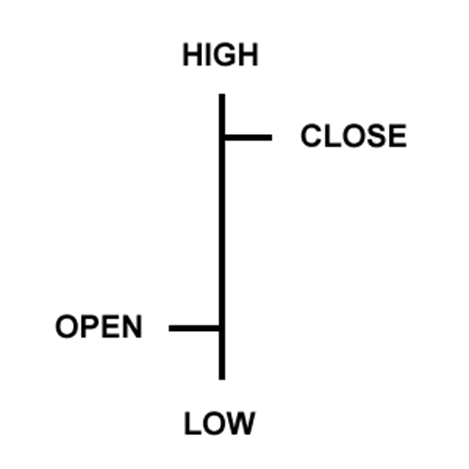
Each individual price bar gives us four pieces of information that we can use to help us make our trading decisions: The open, high, low, and close. You will sometimes see bar charts called OHLC charts (open, high, low, close charts), here’s an example of one price bar:
每个单独的价格条都为我们提供了四条信息,我们可以使用这些信息来帮助我们做出交易决策:开盘价、最高价、最低价和收盘价。您有时会看到称为 OHLC 图表的条形图(开盘图、最高图、最低图、收盘图),下面是一个价格条的示例:
A bar chart will display each period of time as a standard OHLC price bar, as seen here:
条形图将每个时间段显示为标准 OHLC 价格条,如下所示:
Candlestick Charts K 线图
Candlestick charts are price charts that consist of candlesticks instead of traditional price bars, as discussed above. Each candlestick shows the high, low, open and close for the period of time it reflects, this is the same information reflected in traditional price bars, but candlesticks make this information much easier to visualize and make use of…
如上所述,K 线图是由 K 线而不是传统价格条组成的价格图表。每根烛台都显示它所反映的时间段内的最高价、最低价、开盘价和收盘价,这与传统价格条中反映的信息相同,但 K 线图使这些信息更容易可视化和利用……
Candlestick charts indicate the high and low of the given time period just as bar charts do, with a vertical line. The top vertical line is called the upper shadow while the bottom vertical line is called the lower shadow; you might also see the upper and lower shadows referred to as “wicks” or “tails”. The main difference between bar charts and candlesticks charts, lies in how candlestick charts display the opening and closing price. The large block in the middle of the candlestick indicates the range between the opening and closing price. Traditionally this block is called the “real body”.
蜡烛图与条形图一样,用垂直线指示给定时间段的高点和低点。顶部垂直线称为上影线,而底部垂直线称为下影线;您可能还会看到称为 “灯芯” 或 “尾部” 的上阴影和下阴影。条形图和烛台图之间的主要区别在于烛台图如何显示开盘价和收盘价。烛台中间的大块表示开盘价和收盘价之间的范围。传统上,这个块被称为 “real body”。
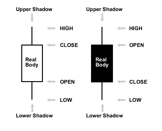
Typically, if the real body is filled in, or darker in color the currency closed lower than it opened, and if the real body is left unfilled, or usually a lighter color, the currency closed higher than it opened. For example, if the real body is white or another light color, the top of the real body likely indicates the close price and the bottom of the real body indicates the open price. If the real body is black or another dark color, the top of the real body likely indicates the open price and the bottom indicates the close price (I used the word “likely” since you can make the real body whatever color you want).
通常,如果真实实体已填充或颜色较深,则货币的收盘价低于开盘价,如果真实实体未填充或通常颜色较浅,则货币的收盘价高于开盘价。例如,如果实体是白色或其他浅色,则实体的顶部可能表示收盘价,实体的底部表示开盘价。如果实体是黑色或其他深色,则实体的顶部可能表示开盘价,底部表示收盘价(我使用了“可能”一词,因为您可以将实体设置为您想要的任何颜色)。
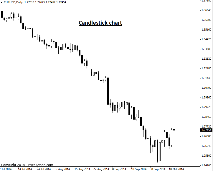
Here’s an example of the same chart used in the line and bar chart examples above, as a candlestick charts:
以下是上述折线图和条形图示例中使用的相同图表的示例,与烛台图相同:
Why Candlestick Charts are best for Price Action Trading
为什么 K 线图最适合价格行为交易
For the following reasons and more, most professional traders use candlestick charts…
出于以下原因以及更多原因,大多数专业交易者使用K线图…
A candlestick chart provides traders with a quick view of overall market sentiment via the colored real bodies of the bars. If a market is very bullish, you will see a lot of white (or whichever color you choose) real bodies, if it’s very bearish for example, you’ll see a lot of black real bodies, this is one big advantage of candlestick charts. The dramatic visual contrast from one candlestick to the next, enables traders to more easily spot price action strategies and visualize the differences in dynamics between price bars in a significantly easier and more enjoyable manner than using standard bar charts.
K线图通过条形图的彩色真实主体为交易者提供了整体市场情绪的快速视图。如果市场非常看涨,你会看到很多白色(或你选择的任何颜色)真实实体,例如,如果市场非常看跌,你会看到很多黑色真实实体,这是 K 线图的一大优势。从一个烛台到下一个烛台的巨大视觉对比,使交易者能够更容易地发现价格行为策略,并以比使用标准条形图更轻松、更有趣的方式可视化价格柱线之间的动态差异。
It’s very important that you use the correct candlestick charting platform, as not all are created equal. The Forex market closes each day following New York trading, at 5pm New York Eastern time. Also, there are 5 full trading days per week in each major trading center around the world. Therefore, you want to use candlestick charts with 5 daily bars per week (not 6 as some show) and that reflect the actual Forex market closing time each day of 5pm NY time. You can download them here.
使用正确的 K 线图平台非常重要,因为并非所有平台都是平等的。外汇市场在纽约交易后每天纽约东部时间下午 5 点收盘。此外,全球每个主要交易中心每周有 5 个完整的交易日。因此,您希望使用每周 5 个每日柱线(而不是某些显示的 6 个)的烛台图,并反映纽约时间每天下午 5 点的实际外汇市场收盘时间。您可以在此处下载它们。

